A captivating non-fiction book cover requires the presence of the following elements to successfully attract readers:
- Impactful book title
- Informative subtitle
- Relevant artwork
- Evocative colour palette
- Clear typography
- Dazzling reviews and endorsements
- Concise author bio
- Interesting book summary
- Polished presentation
#1 Impactful book title
A captivating title plays a pivotal role in the allure of a non-fiction book cover because it is the initial point of contact for a reader assessing your book. Hence, it should be characterised by readability and memorability. Furthermore, the title should show a balance between clarity and intrigue: clarity and directness hold as much weight as the element of wit and allure in the title’s composition.
Ensure your title stands out prominently, especially on competitive platforms like Amazon. There, the choice of publications on any and all subjects overflows, prompting potential readers to take notice of most eye-catching covers.
Add specificity with numbers
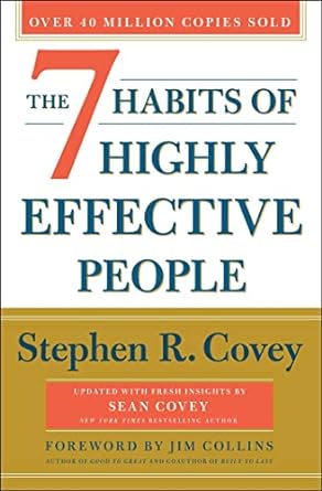
Readers may respond to a specific number of takeaways your book contains. For instance, The 7 Habits of Highly Effective People breaks a broad topic into seven digestible parts. Similarly, Learn to Paint Watercolor in 30 Days communicates the timeline during which the readers are promised to master a skill. In both cases, numbers help convey the message of the book by adding credibility and relevance.
Be concise
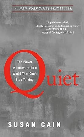
A title with a few short words can create far more impact than wordy titles. To accommodate additional details, make use of a subtitle. For instance, in Quiet: The Power of Introverts in a World That Can’t Stop Talking, a one-word title is followed by an eleven-word subtitle. In this case, the title makes the impact, and the subtitle provides the context.
Choose the right tone
The tone of the title has accommodated the message of the book and its intended readership. For instance, in The Subtle Art of Not Giving a F*ck, the swear word reflects the non-compromising message of the book. Equally, it signals that this book is written for adult readers.
Make a promise
Readers buy non-fiction books for a purpose, so choose a title that clearly describes the change (in knowledge or skills) your book will provide. The best titles promise to solve a problem or help readers achieve a desired goal. For instance, The Screenplay Outline Workbook: A step-by-step guide to brainstorm ideas, structure your story, and prepare to write your best screenplay. Although a bit wordy, this title effectively conveys the purpose of the book.
Identify your target readers
Identify your intended readers or their attributes in your book’s title so that they can quickly identify your book as written specifically for them. Social Media Marketing All-in-One for Dummies or Piano Book for Adult Beginners identify their intended readers.
Use a wordplay or a metaphor
A catchy wordplay or a captivating metaphor can make the title of your non-fiction book more memorable. For instance, The Glass Castle refers to the author’s childhood home, a makeshift dwelling constructed by her unconventional and nomadic parents. Additionally, it serves as a symbol of the author’s father’s unrealised dreams and unfulfilled promises.


Use a title generator
If you still lack inspiration, an array of book title generators is available online. Book title generators may help if you have only started writing your manuscript. Moreover, they can be helpful if you have already completed the manuscript and the title is the only component missing. Here are some book title generators to try out:
#2 Informative subtitle
In non-fiction book covers, the subtitle is a crucial element accompanying the title. Complementing the book title, this smaller line of text imparts additional insights about your book. While the title is the initial attraction, the subtitle is responsible for providing information about the book’s topic.
A well-crafted subtitle is a clarifying agent for a title that might otherwise seem ambiguous. It introduces fresh information, providing context and depth. Here are some examples of informative subtitles on non-fiction book covers:
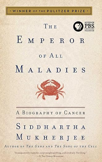
- The title The Emperor of All Maladies (written by Siddhartha Mukherjee, a cancer physician and researcher at Columbia University) is followed by a subtitle, A Biography of Cancer, which explains the book’s focus.
- Following the title, The Courage to Be Disliked (which guides the readers through the concepts of self-forgiveness, self-care and mind decluttering), the longish subtitle contextualises the book’s topic: The Japanese Phenomenon That Shows You How to Change Your Life and Achieve Real Happiness.
- Written by a bestselling author and journalist, Sathnam Sanghera, Empireland’s subtitle delineates that the book looks into How Imperialism Shaped Modern Britain.


#3 Relevant artwork
A book cover’s layout should seamlessly integrate typography and imagery, constituting vital components in non-fiction book cover design. On the other hand, the effectiveness of a cover artwork layout lies in its ability to etch a distinct impression of your book in the reader’s mind. Modern non-fiction book cover artwork is often minimal but embedded with the symbolism relevant to the book’s topic and argument, as illustrated by the following notable non-fiction publications:
- On the cover of Sapiens: A Brief History of Humankind by Yuval Noah Harari, there is only a single piece of artwork — a fingerprint, which symbolises the topic of the book: humankind and its history.
- The cover of An Ethics of Interrogation by Michael Skerker, with an image of a single uncovered lightbulb on a dark background, effectively conveys the controversy over prisoners’ interrogation by associating them with dark, dimly lit interiors.
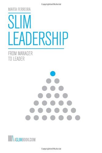
- The artwork of Slim Leadership: From Manager to Leader consists of a pyramid made of grey dots, except the dot on the top of the pyramid, which is blue. This simple structure reflects the role and position of a leader.


The visual elements or the artwork placed on the book cover should reflect the topic and genre of your book. In other words, the artwork should complement the storytelling. Thinking about your book, are there any elements of the story or argument that can be translated into visual elements? Even if only abstract concepts associated with your non-fiction book come into mind, such as business, technology and colonialism, you can use the AI design assistants to conceptualise these high-level topics. To generate cover artwork based on your prompts, try:
#4 Evocative colour palette
A design principle used to choose a colour palette is based on the premise that colours evoke emotions, although there is no universal way in which colours affect everyone. For instance, human psychology, biological conditioning and cultural background may be factors directing one’s reaction to a specific colour. Nonetheless, we can discern some general emotive reactions that colours or colour groups evoke. For example, 99 Designs created a list of colours and emotions they evoke:
- Black: sophisticated, classic, serious
- Blue: secure, relaxed, spiritual, calm, cold
- Brown: warm, grounded, practical, comforted
- Grey: serious, professional, reliable
- Green: fresh, balanced, calm
- Orange: energetic, enthusiastic, lively, happy
- Pink: playful, romantic, tender, cute, fun
- Red: passionate, energetic, angry, dangerous, lucky
- White: simple, peaceful, elegant, cold
- Yellow: happy, spontaneous, cheerful, optimistic
Use a colour palette generator
Once you know what colours (and feelings) your books should evoke in potential readers, encompass them in a visually appealing palette for your non-fiction book cover. For instance, apply the colour theory, which explains how to choose colours that complement each other and their optimal hues, values and saturation. But if you are not interested in learning about colour theory, try one of the free colour palette generators, such as:
Create an inclusive palette
Remember, we see colour differently, and with around 300 million people in the world living with colourblindness, it is important to make your non-fiction book cover’s palette inclusive and accessible. There are different types of colourblindness, but there are some general rules that can be applied. First, when designing a palette with consideration of people with colourblindness, avoid combining red and green. Instead, try to use only two basic colours: blue and red (orange and yellow will also fit). Second, use highly contrasting colours and play with the dark/light saturation to make the contrast more pronounced.
#5 Clear typography
Typography plays a pivotal role in non-fiction book cover design. It serves to emphasise your title and subtitle, ensuring they command attention. A well-crafted book cover captures attention and effectively communicates the book’s essence through its typographic elements. Moreover, the font choice must align cohesively with the tone and style of your book cover. For instance, for a contemporary design, casual fonts like Helvetica Neue or Arial Black could work. Conversely, elegant covers might benefit from classical fonts such as Garamond or Times New Roman. Should your book exude a retro vibe, fonts like Futura or Helvetica Rounded Bold could be more fitting choices.
When choosing the typography style for your non-fiction book cover, consider contrast, integration with the artwork, use of negative space and role of typography in improving accessibility of your non-fiction book cover.
Emphasise the message with contrast
Effective use of contrasting colours or fonts makes the title stand out. Take the cover of Social Justice Fallacies as an example. Distinguishing the word Fallacies with a distinctive colour and typeface draws the visual focus and hints at the focus of the book.
Integrate typography with artwork
Integrating typography as a visual element or turning the text into a design feature itself may help attract the reader. For instance, the first letter of the title Quiet simultaneously serves as a frame for the subtitle while driving the visual focus towards it.
Use negative space
Using negative space effectively draws attention to the typography. This technique is in use on the cover of Come as You Are.
Consider accessibility
Typography is also important when it comes to fostering inclusivity, accessibility and readability. For instance, the British Dyslexia Association recommends Arial and Comic Sans, as letters can appear less crowded. Alternatives include Verdana, Tahoma, Century Gothic, Trebuchet, Calibri and Open Sans. Furthermore, Vision Australia, Australia’s provider of blindness and low vision services, suggests sans serif (for instance, Georgia and Sabon) and serif (such as Calibri, Verdana and Tahoma) family typefaces as more accessible.


#6 Dazzling reviews and endorsements
Typically, concise endorsements find their place on the front cover, capturing attention with concise praise. Meanwhile, more elaborate and detailed reviews find space on the back cover, offering a deeper insight into the book’s merits and fostering credibility.
Authorities in the topic of your books are ideal sources of endorsements that will support the credibility of your book. For instance, on the back cover of A History of Language by Steven Roger Fischer, we find an endorsement from Noam Chomsky, sometimes called the ‘father of modern linguistics,’ an American linguistics professor. Chomsky calls A History of Language ‘stimulating and highly informative inquiry,’ thus testifying to the high quality of research enclosed on the pages of Fischer’s book.
An authority does not have to be a person; it could also be an institution, organisation or publication, such as a magazine or a newspaper, with an established reputation. For example, New Scientist, a renowned popular science magazine covering all aspects of science and technology, endorsed Bessel van der Kolk’s The Body Keeps the Score as follows: ‘Van der Kolk draws on thirty years of experience to argue powerfully that trauma is one of the West’s most urgent public health issues … Packed with science and human histories.’ New Scientist’s review legitimises the findings of the book and emphasises their significance and currency.
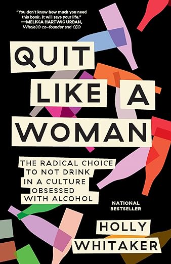
Another important quality of good reviews and endorsements is the call to action, which encourages the readers to buy and read the book and creates a sense of urgency. Similarly, the blurb on the cover of Quit Like a Woman portrays the call to action and the sense of urgency it creates by stating: ‘You don’t know how much you need this book. It will change your life.’


#7 Concise author bio
A strategically positioned author bio holds significant sway in non-fiction book covers. When perusing a book, readers inherently seek insights into the author to understand how the author builds authority in the topic of their book. This brief narrative, typically three sentences long, gives a window into the author’s experience and allows them to build trust and rapport with the readers.
The author’s bio should highlight relevant credentials and previous works in the field to augment credibility and reader engagement. This could include the author’s educational and professional history, previous publications, awards and recognitions.
Professional expertise
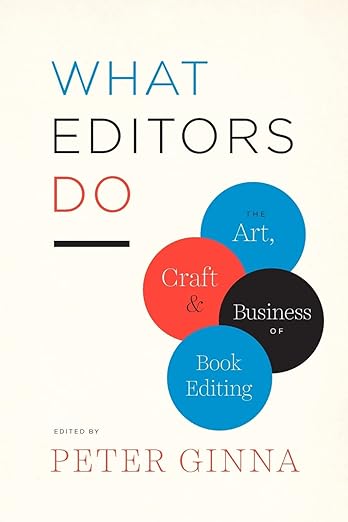
On the back of the cover of What Editors Do, the biography of the editor, Peter Ginna, reads as follows:
Peter Ginna has been an editor and publisher for over thirty years, most recently at Bloomsbury Press; he has also held editorial positions at Oxford University Press, Crown Publishers, St. Martin’s Press, and Persea Books.
The focus of this bio (although in this case, it is an editor’s bio) is on the editor’s employment history spanning over thirty years. It highlights their professional expertise to establish their credibility and instil readers’ trust.
Academic credibility
Our Dogs, Our Selves is part of a series, and to establish the authority of the series editor, their biography has been included on the cover:
Laura D. Gefland, Ph.D. (1994), Case Western Reserve University, is a Professor of Art History at Utah State University. She has published widely on Northern Renaissance art and architecture and co-edits the series Art and Material Culture in Renaissance Europe (Brill).
This editor’s biography demonstrates topical expertise and academic credentials to convey academic rigour to the researchers reaching for this volume.
List of publications
The bio on the back of A Short History of Nearly Everything introduces the author as follows:
Bill Bryson is Britain’s best-loved travel writer, and the author of the hilarious classics The Lost Continent, Neither Here nor There, Notes from a Small Island, A Walk in the Woods, Notes from a Big Country and Down Under. He has also written two more sedentary and contemplative books about the English language, Mother Tongue and Made in America.
The text lists the author’s publications, which establish Bryson’s authority in the topic of the book.


#8 Interesting book summary
A book summary, also known as a book blurb, is a concise, carefully crafted piece of text found on the back cover or inside the dust jacket of a book. It serves as a mini-preview, providing readers with a glimpse into the content and tone of the book. Its most important function is to provoke readers’ interest and convince them to purchase the book.
An interesting book summary found on the cover of a non-fiction book should convey:
- Snapshot: A summary offers a snapshot of the book’s essence, highlighting its genre, theme and central argument and topic.
- Intrigue: Its primary purpose is to captivate the reader’s interest and curiosity, compelling them to buy and read the book.
- Significance and connection: A book summary should reveal the importance of the findings and argument of the non-fiction book, explaining to the reader the new knowledge uncovered in the book is relevant to them.
- Wording: Use clear and concise wording that reflects the tone and language of the book. Most importantly, ensure that the spelling and grammar are impeccable and with no mistakes to avoid the impression of sloppiness and unprofessionalism.
Rules for crafting an interesting book summary
- Keep it concise — 200 words or less
- Connect with your target reader by explaining why this book should matter to them
- Include research questions answered in the book
- Hint — not reveal — your most significant findings
#9 Polished presentation
Crafting a captivating non-fiction book cover is an intricate process that extends beyond visual design. Recognising the critical role of precise language and polished content, professional editorial services are tailored to enhance the overall quality of your non-fiction, academic or business book cover.
Proofreading
Proofreading ensures that the text on your cover is free from grammatical errors and typographical glitches. Moreover, a flawlessly executed proofreading process guarantees that your book cover exudes professionalism and attention to detail.
Copyediting
Beyond the visual allure, the language on your book cover plays a pivotal role in engaging potential readers. Copyediting service fine-tunes the text, addressing grammar, syntax and style. This ensures that the language is not only correct but also resonates with your target audience, contributing to the overall visual and textual harmony of the cover.
Line editing
Delving into the nuances of each line and paragraph, line editing is especially crucial for the concise text featured on a book cover. This service ensures that every word is impactful, well-structured and contributes seamlessly to the overall visual and textual aesthetic of the cover.
Translation editing
For book covers featuring translated content, maintaining linguistic integrity is paramount. Translation editing service verifies the accuracy of the translated text, ensuring that it not only reflects the original meaning but also aligns with the tone and style intended for your audience.
Developmental editing
Developmental editing is essential for ensuring that the content and structure of your book cover align with your overarching message. This service enhances the conceptual framework, making certain that the cover effectively communicates the essence of your non-fiction work to potential readers.
Final thoughts
In conclusion, a captivating non-fiction book cover is a harmonious blend of visual and textual elements, working to captivate, inform and entice readers into the world within the pages.
I am an experienced editor, working with non-fiction, academic and business books. If you need a second pair of eyes, proofreading and editing the text selected for the cover or preparing your manuscript for publication, contact me for a free sample edit (and remember to use my early bird discount).